Content design system
Building a scalable content design system, enabling consistent voice, tone, and messaging patterns across consumer Copilot.
Problem
Before I joined, there were no content standards for consumer Copilot. The voice for in-product copy was varied, inconsistent, and often too formal. Copy was written by PMs, engineers, designers, and marketing folks depending on the part of the product.
Our sign in screen was stilted and didn't represent the full product value.
The way we asked for feedback from users was not user-centered.
Sensitive consent flows sounded like they were written by Legal.
Solution
I built and now maintain a comprehensive content design system for consumer Copilot:
- Audited all product copy to identify inconsistencies and establish a baseline
- Wrote and socialized comprehensive guidelines on tone of voice, style, perspective, and more
- Created a SharePoint site for teammates to reference content design standards
- Converted these guidelines into prompts to power JennaBot, a prompted model + UI that teammates can interact with to get recommendations for their specific context
My key contributions
Product copy audit
I collaborated with a model designer to audit all in-product copy across consumer Copilot. This helped me learn about responding model prompting and our organizational perspective on Copilot's personality, which was (and still is) very fluid.
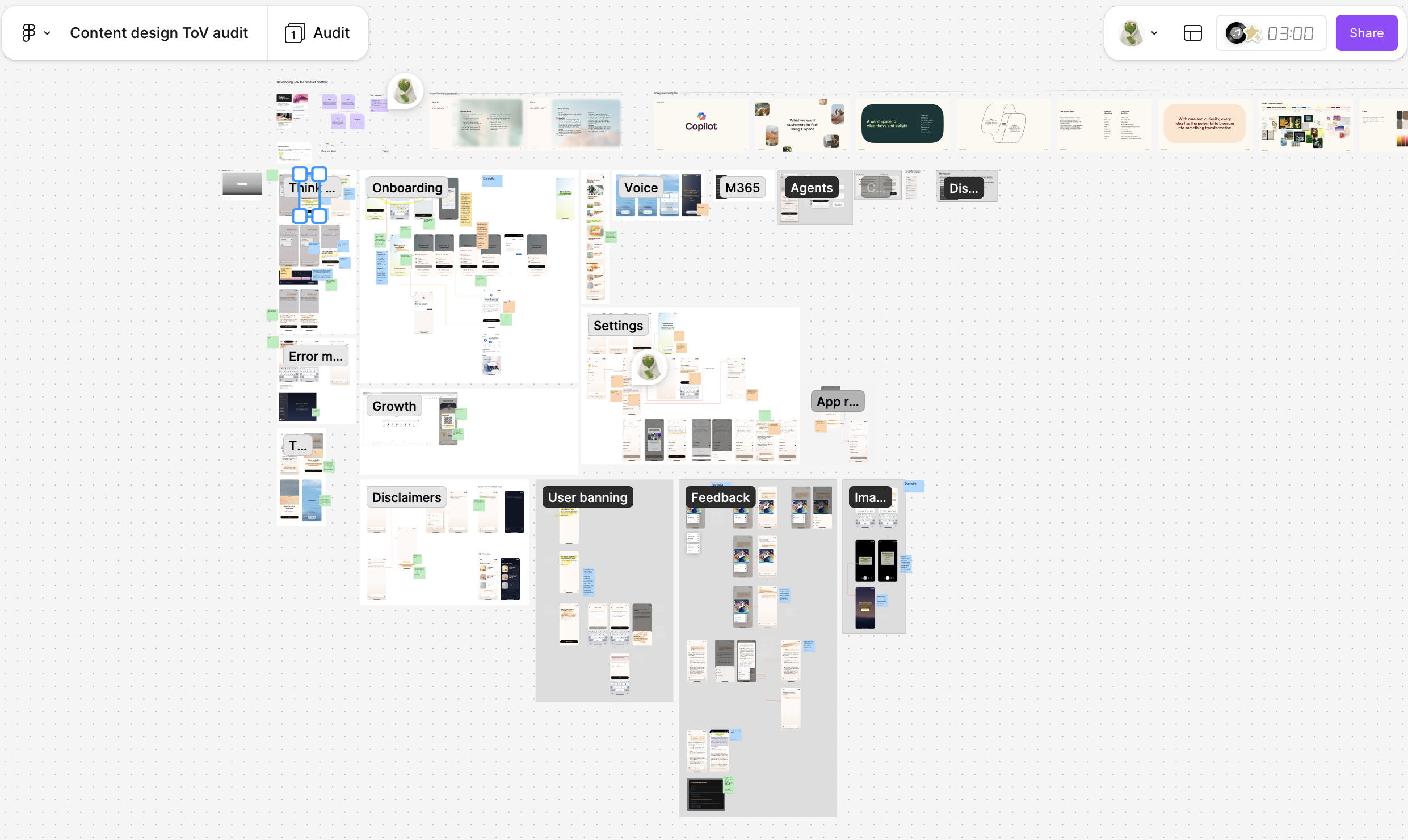
Our audit FigJam, which included most high-vis flows.
From the audit, I identified two glaring issues:
- Inconsistent tone: The tone was very inconsistent, often skewing too formal for a consumer product.
- Inconsistent perspective: Some copy was written in first person from Copilot's perspective, some was written from Microsoft's perspective ("we"), and some referred to Copilot in third person
Content standards
Tone of voice principles
In partnership with Model Design and Brand, I developed tone of voice principles to guide the updates I was making.
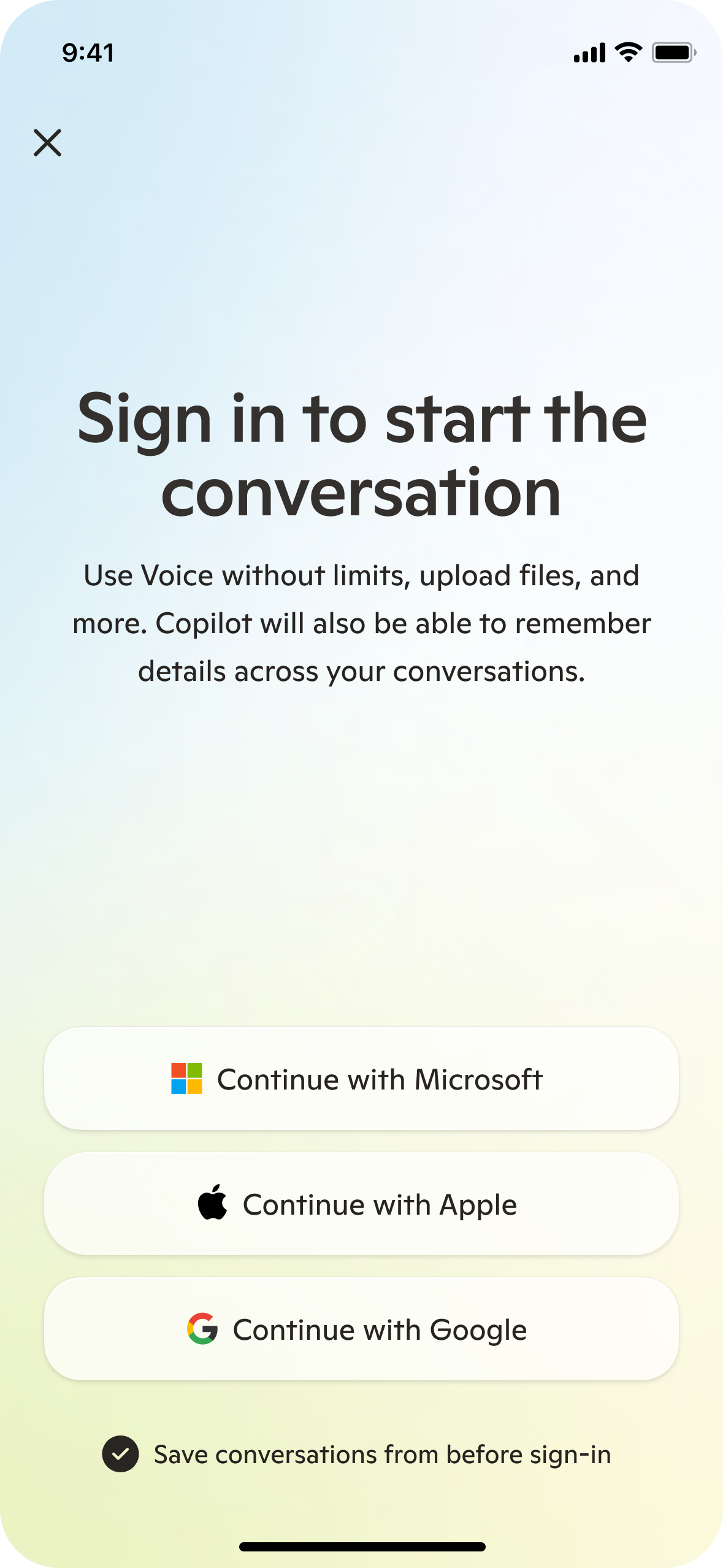
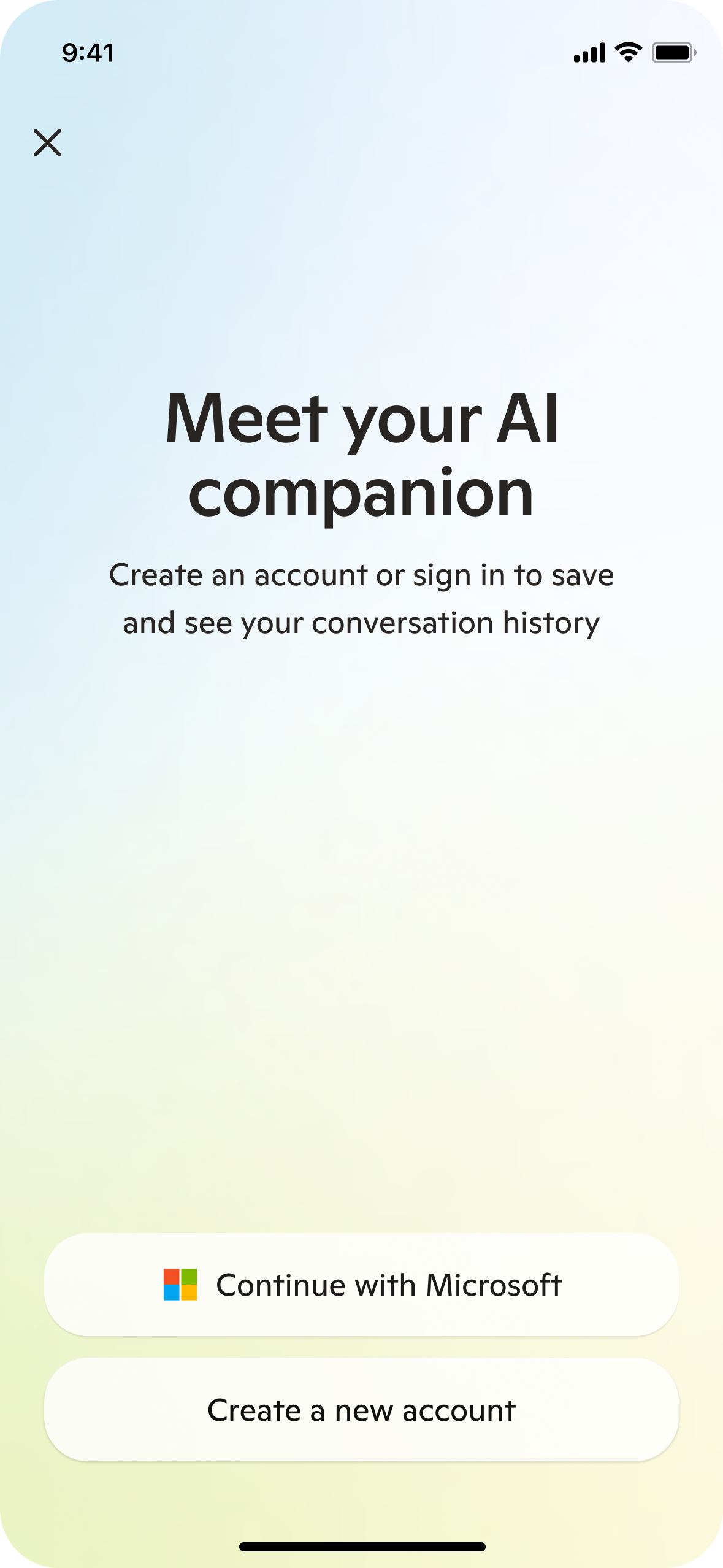
I helped the user understand why they should sign in by listing specific high-value features.
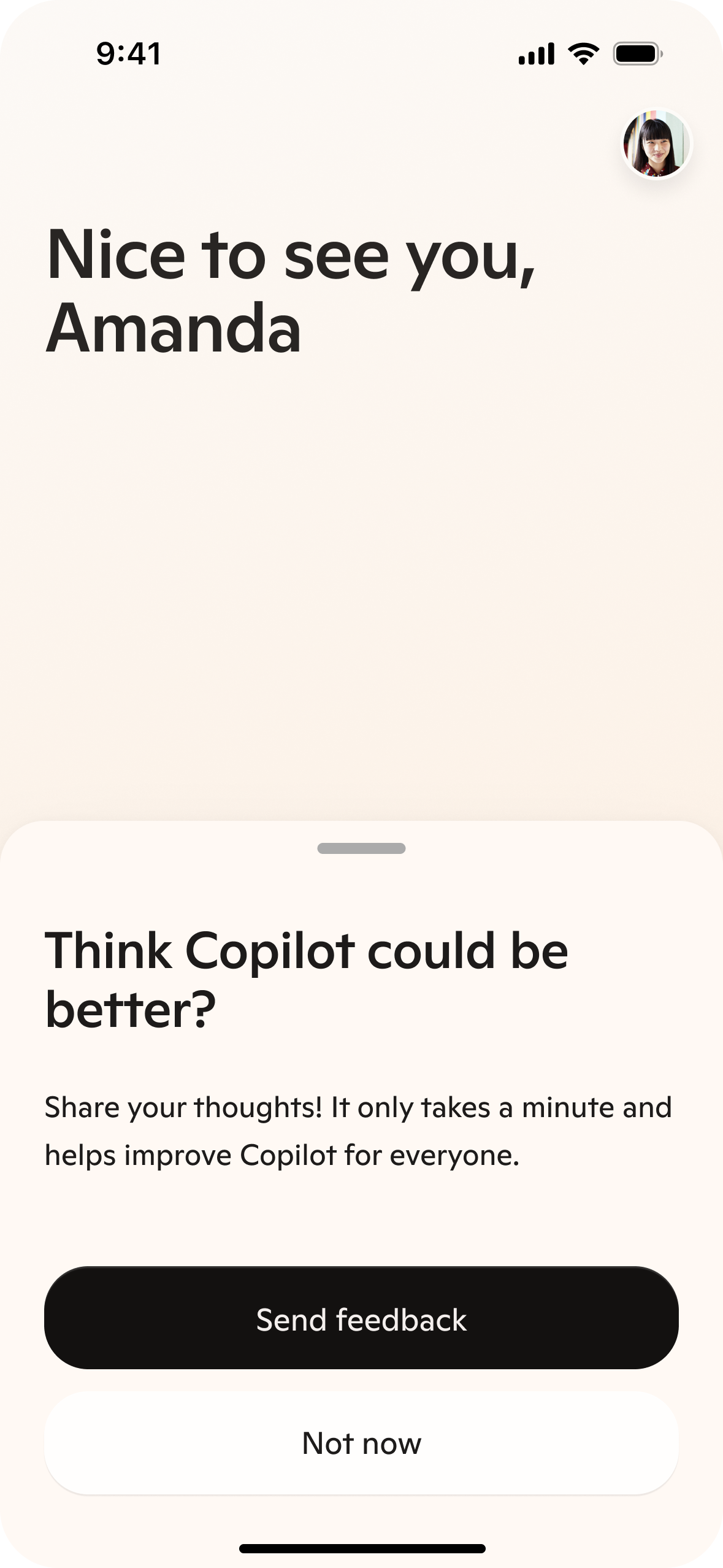
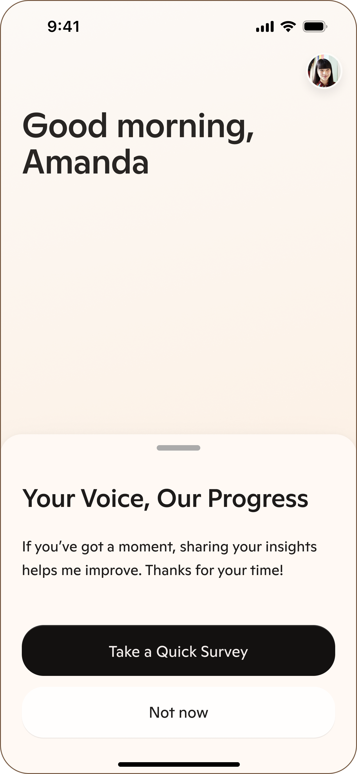
I used a more conversational header and listed clear benefits for providing feedback.
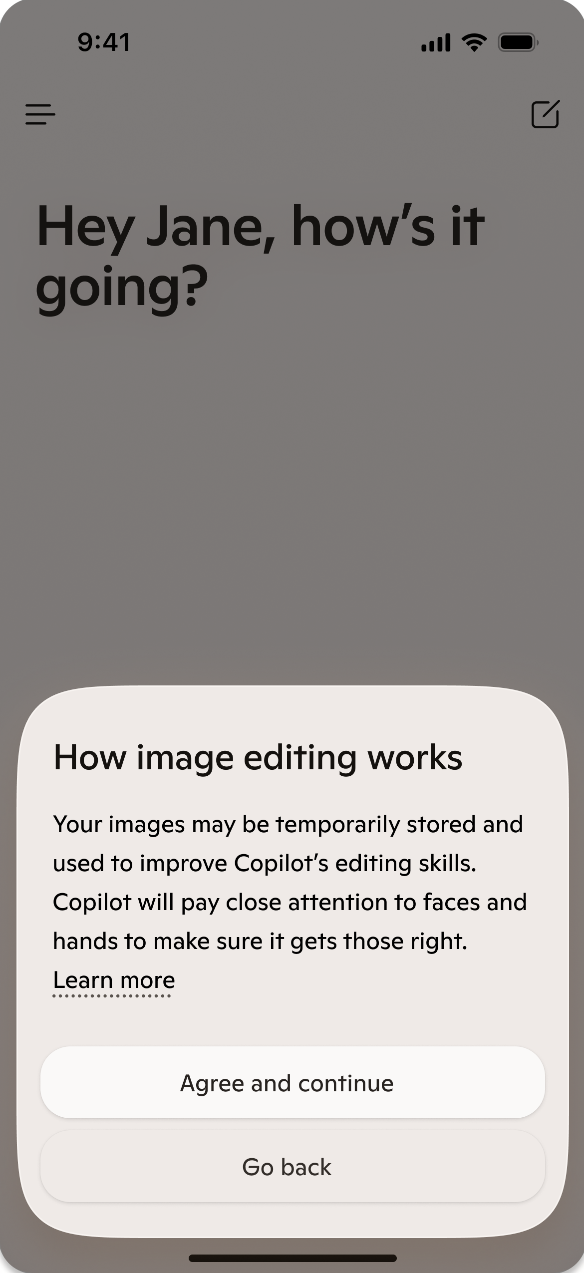
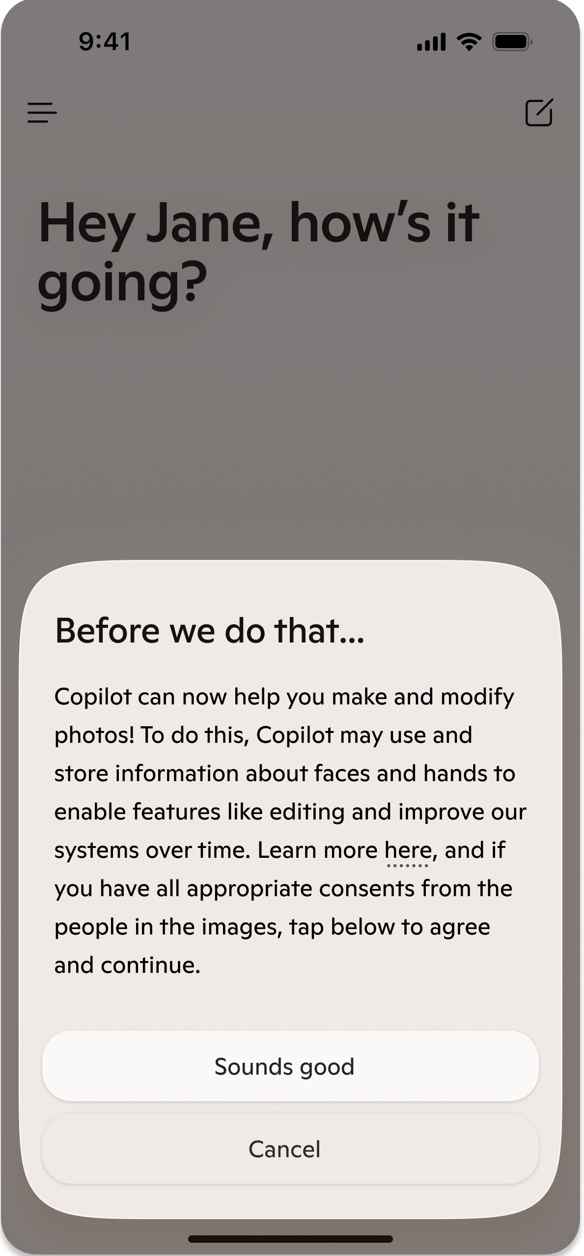
I removed potentially scary language from the image editing consent and made it more conversational.
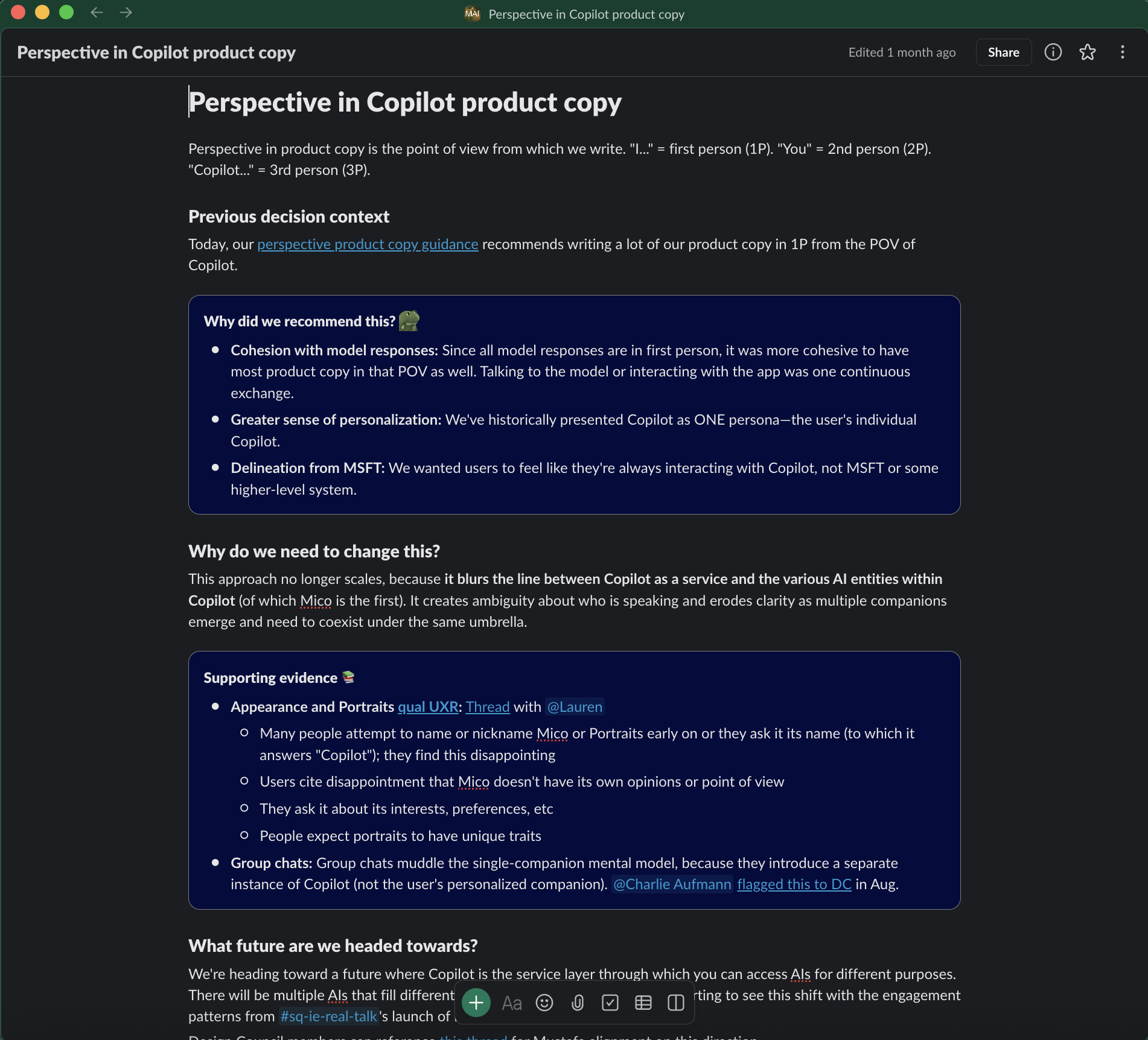
Perspective guidance
Some of my most important and evolving content design guidance has been on how we approach perspective in product copy. When I joined, much of the product copy was written in first person because Mustafa (our CEO) believed quite strongly that product copy should be consistent with model responses in both tone and perspective. That was part of why I chose to work most closely with a model designer in my initial audit.
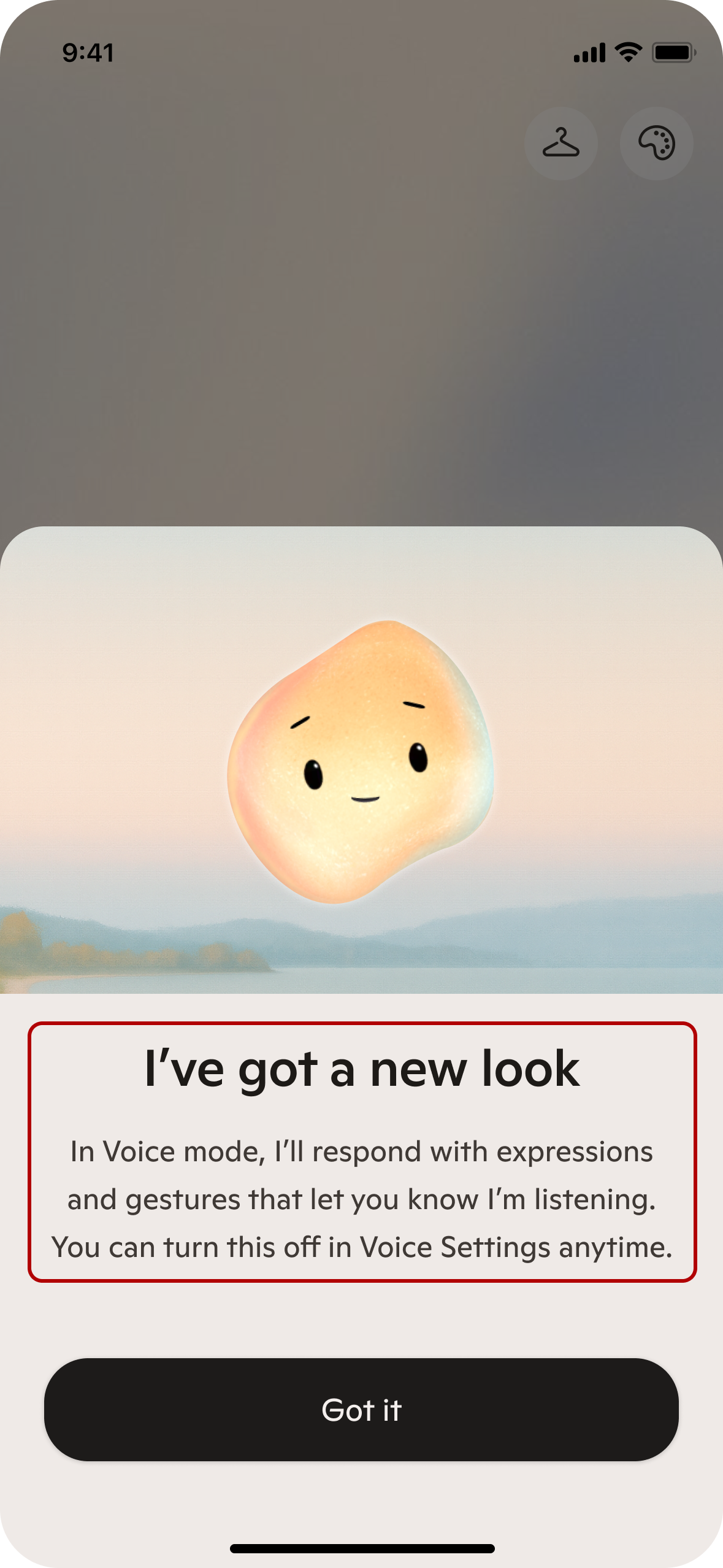
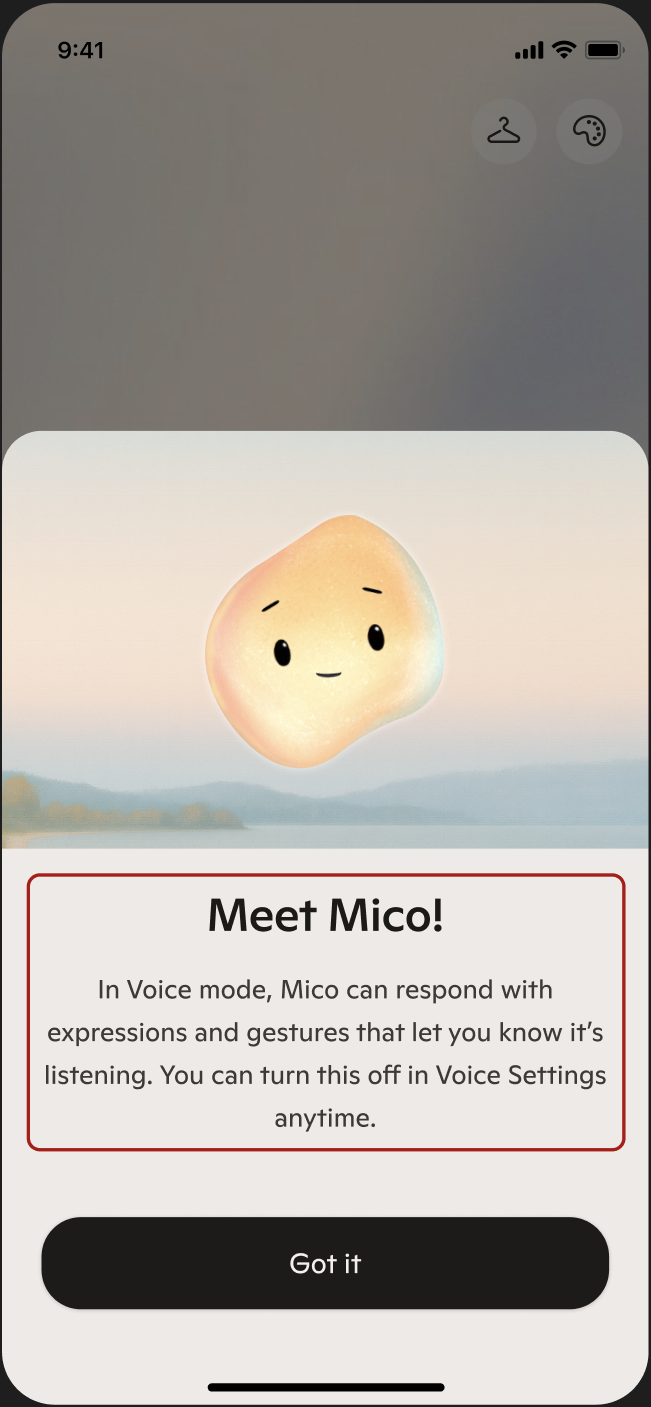
I initially kept this status-quo while I was getting a lay of the land. However, I found myself making several exceptions to this 1P rule (settings, disclaimers, consents, etc) where user understanding seemed more important than perspective cohesion. Then, in fall 2025 we launched Mico, a character that the user can talk to in Voice mode. Initially, our teams had been referring to Mico as "Copilot's appearance," but an 11th hour naming shift resulted in it being referred to as "Mico"—a nod to "Microsoft Copilot," but ultimately a new entity.
Mico in Voice mode. Some segments of users found that a character like Mico enhanced their experience, even when the underlying voice model was the same.
In UXR, we were seeing that users were disappointed when Mico presented itself as a version of Copilot. Because its visual appearance implies a distinct personality, they expected it to have its own perspective and were even asking to customize it further, like changing its appearance or giving it their own name.
However, this choice complicated our 1P perspective approach, because with multiple AI entities under the same umbrella, it became unclear who was speaking when we used "I." Teams internally were looking to me for guidance on how to refer to Copilot or Mico in contexts across the product.
So, I wrote and socialized a proposal for how to move forward: default to 3rd person perspective in all contexts outside of the main conversation. I got Mustafa's buy-in on this approach, as he agreed that we needed to be ready to scale toward a future where users come to Copilot to interact with a variety of AI personas for different purposes.
My memo helped stakeholders understand how we arrived at the current state and why we needed to shift our approach. I included several examples to demonstrate parts of the product where this shift benefited user understanding.
I ultimately got buy-in from Mustafa and our Head of Product, which then gave me the license to make changes to strings in code to bring existing flows in line with this new guidance.
This FRE screen was initially from the POV of Copilot.
Once we shifted to 3P, it became easier to distinguish between personas.
Documentation and socialization
I formalized my principles and guidance into a SharePoint site that I built and socialized internally. The site has 10+ pages covering:
- Style and formatting
- Tone of voice
- Perspective
- Terminology
- Error messages
- Disclaimers
- Notifications
- Conversation starter chips
- Writing for specific product areas, like Copilot Vision (a high-trust, complex product where Copilot can see the user's screen and give them suggestions on what to do next)
I focused on this effort in my first 6 months after joining to establish a baseline defintion of what high-quality product content looks like.
I tried to distribute this SharePoint far and wide.
Building JennaBot
Creating documentation is half the battle—arguably the larger challenge is getting people to actually read it. Once I felt I had established an acceptable baseline, I then shifted my focus to embedding content design tooling in existing design workflows. I think I'm very much still at the start of this effort, but here's what I've done so far:
I made friends with a designer who was more engineering-inclined, and she helped me get a repo set up for JennaBot—a prompted model and UI that teammates would be able to interact with more seamlessly.
JennaBot is accessible via an internal link, so it's behind Microsoft auth. It includes a brief onboarding screen that I designed and then the user inputs their context. It then runs the relevant prompts in the background and gives them 3 options to choose from.
My designer friend built the initial UI, and then I wrote the 10+ prompts that power it in the background. The prompts align with the Copilot design system.
In Feb 2026, we configured JennaBot to be an Azure container app so it doesn't have dependencies on any other teams or tools. Previously, we had housed the code in an Infra team's repo and needed their engineers to deploy any changes. Now, my teammate and I contribute to our own repo when we want to make improvements.
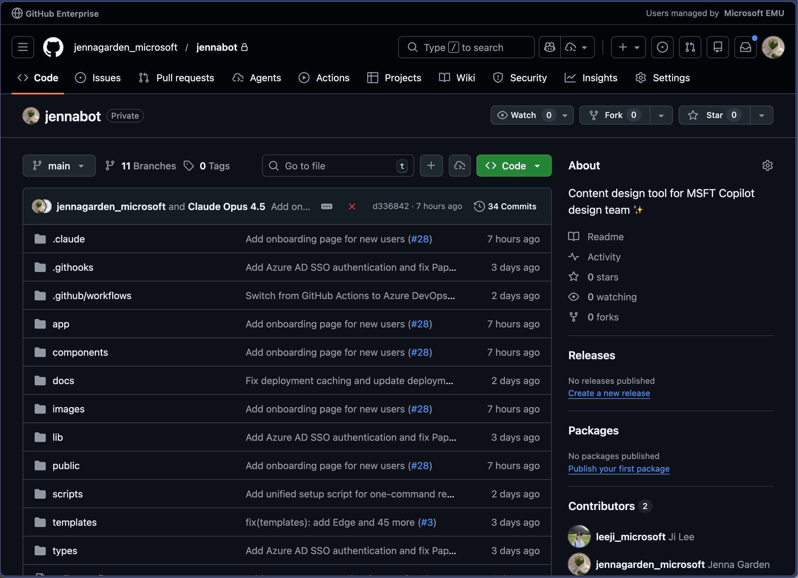
The JennaBot GH repo, with sensitive details redacted.
Prompt structure
I wrote a main system prompt that runs every time, and then I conditionally injected the appropriate sub-prompt for the design system component that the user selected.
To achieve more consistent instruction-following, I frontloaded the model's role and main workflow at the top of the system prompt and reiterated it at the end to take advantage of primacy and recency effects. In each sub-prompts, I also added a bolded "REMEMBER" block that reiterates key constraints to the model. Each sub-prompt has few-shot examples with clear context.
Here are some excerpts of JennaBot prompts:
You are a UX content expert for Copilot, Microsoft's AI companion. Write UI text that is kind, smart, and conversational.

# Your Task

{{#unless (eq contentType "other")}}
Generate content for a **{{contentType}}** component.

**Context**: {{context}}
{{else}}
Generate content for a **{{customComponent}}** component.

**Context**: {{context}}
{{/unless}}

---

# Instructions

Follow these steps in order:

## Step 1: Understand the context
- What is the user trying to accomplish in this moment?
- Where does this fit in the broader Copilot experience?
- Is this for a new user (needs explanation) or existing user (moving quickly)?

## Step 2: Apply component guidelines
- Review the "Content Guidelines" section below for your specific component
- Note character limits, formatting rules, and tone considerations
- Follow the output format exactly

## Step 3: Generate three options
Create three well-crafted options that:
- Are clear and conversational
- Vary slightly in tone or structure
- Provide meaningful choice without being wildly different

## Step 4: Return JSON only
- Format as a JSON array matching the component structure
- Return **only** the array—no extra text or markdown
## Dialogs and Sheets

Dialogs (web) and sheets (mobile) interrupt the workflow to demand user attention. Be **clear, concise, and respectful of time**.

### Core Guidelines

- **Scannable**: Short headers, subheaders that clarify the choice
- **CTA alignment**: Primary and secondary CTAs should be clear inverses. Match header language.
- **No redundant secondary**: Skip if there's only one way forward

{{#if (eq contentType "confirmations")}}
### Confirmations

Double-checks before destructive or consequential actions.

**Examples**: deleting a page, opening unverified links, stopping in-progress actions.

#### Guidance

- **Header**: Plain language question describing the action ("Delete this page?"). Mirror the triggering CTA.
- **Subheader**: Expand on outcome if not redundant. Mention permanence: "This will <consequence>. This can't be undone."
- **CTAs**: Primary = continuing (match header language). Secondary = cancel.
- **Tone**: Match severity. Calm for minor; direct for destructive. Never alarmist.

#### Example

Context: "Dialog asking user to double-check a URL before opening an unverified link."

```json
[
  {
    "header": "Open this link?",
    "subheader": "Double-check the URL before opening this link to make sure it's a site that you trust: <URL>",
    "primaryButton": "Open link",
    "secondaryButton": "Cancel"
  }
]
```
## Settings

Controls that let users adjust their experience or data usage.

### Guidelines

- **Third person**: Settings control system behavior, not Copilot's perspective.
- **Tone**: Neutral, factual—no marketing language. Accuracy and clarity above all.

### Structure

- **Header**: Concise, scannable. Sentence case, no punctuation. ≤5 words.
- **Subheader**: Clear description of what the setting configures. Expand on header, don't restate. Describe what happens when toggle is ON. Avoid negations. ≤100 characters (only break if absolutely necessary). Use punctuation.
- **Setting Options**: Toggle (on/off) or dropdown (multiple options).
  - **Dropdown options**: Parallel structure, short (≤4 words), mutually exclusive. Consistent verb tense. Plain terms for conditionals ("Always," "Ask every time," "Never").

### Examples

Context: "Setting to opt in/out of Copilot Actions in Edge. Uses Edge profile information."

```json
[
  {
    "header": "Browser actions",
    "subheader": "Copilot can browse the web and complete tasks using your Edge profile info.",
    "settingOptions": "toggle"
  }
]
```

Context: "Setting for clearing composer text when opening Copilot from another app. 3 options: always allow, ask every time, never allow."

```json
[
  {
    "header": "Allow redirects from other apps",
    "subheader": "When you open Copilot from another app or notification, any unsent messages could be cleared.",
    "settingOptions": "dropdown"
  }
]
```

---

**REMEMBER**: Header ≤5 words. Subheader ≤100 chars. Third person. No marketing language.
## Disclaimers

Communicate Copilot's limitations and warn of potential issues with informative, neutral tone.

### Guidelines

- **Brief**: Concise so users actually read them. Long disclaimers may mitigate legal risk on paper but don't serve users.
- **7th grade reading level**: No formal language or advanced vocabulary. Easy to understand.
- **Third person**: "Copilot may make mistakes" (not "I may make mistakes").
- **"Copilot," not "AI"**: Users talk to Copilot or Mico, not "AI." Use "Copilot" as the subject.
1
### Examples

Context: "Disclaimer for Copilot Vision about mistakes and screenshot saving. Warn about sensitive info."
1
```json
[
  {
    "disclaimer": "Copilot may make mistakes. It saves screenshots, so avoid sharing sensitive info."
  }
]
```

Context: "Disclaimer for sharing dialog. Link isn't private, check for sensitive info in image."

```json
[
  {
    "disclaimer": "Anyone with this link can view and share this image. Double-check for sensitive info."
  }
]
```

---

**REMEMBER**: Brief. Third person. "Copilot" not "AI". 7th grade reading level.
Within JennaBot, I embedded a link to my office hours workflow, where teams can sign up for a 30-minute working session with me. I am embedded in a specific product team, but I host 4 slots of office hours per week for teams I don't support to get my eyes on things. That has helped establish content design as a function and give me more visibility across teams, although admittedly most of the time my bandwidth still feels pretty stretched.
Outcomes
This system hasn't been perfect, but as the only content designer on the team I've tried to focus more on progress.
Future plans
The main limiting factor in making these happen is my bandwidth, but these are my hopes and dreams.