Product safety
Translating regulatory requirements into clear, human, and usable product experiences
Problem
Microsoft has historically had a very positive relationship with regulators interested in AI safety. Throughout 2025, there were several new regulatory requirements that we needed to meet to both maintain these relationships and help keep vulnerable users safe. These requirements included:
- Clearly disclosing that users are interacting with an AI
- Communicating model fallibility
- Informing users about personalization settings and data usage
- Protecting vulnerable or potentially overreliant users, including teens
Before I joined the team, however, many of the safety and compliance-driven experiences used overly legalistic language that wasn't actually serving its intended purpose.
Solution
I led 3 safety-related projects to ensure we met regulatory requirements without sacrificing clarity, brand voice, and trust. None of these projects had a clear Product owner (with Legal often being the most engaged stakeholder 😄) so I wrote specs, drove design iterations, and (of course) finessed language until it felt good.
My key contributions
Zero input disclaimer
All consumer AI products have some version of this little string, and before joining MAI I didn't realize how much thought went into it. In Jan 2025 (on my second day on the job!), one of our org's VP's flagged that the existing disclaimer language was too long and verbose. It was particularly noticeable because Legal communicated that it needed to be presented every time before a user began a conversation with Copilot.
The disclaimer had been written by a member of our Legal team with the goal of communicating all of these ideas:
- Fallibility: Communicating that Copilot can make mistakes.
- Personalization: In some markets, we have personalization settings on by default, so MSFT's position is to go beyond competitors and proactively inform users of this.
- Model training: In some markets, we also use conversation data for training our own models. We feel that users should be proactively informed of this as well.
- Clear opt out: We should route users to settings if they'd like to opt out of these defaults.
While I was aligned with these requirements from a user trust perspective, I also wanted to ensure that we weren't compromising on UX quality by showing users potentially redundant language at the start of every conversation.
After a lot of negotiation with senior Legal stakeholders, we revised the existing language to shorten it and aligned on logic to only show a longer version of the string once every 6 months to users. I explained that this was still proactive, but because changing the related settings was a pretty infrequent action, it wasn't serving the user to repeatedly surface it.
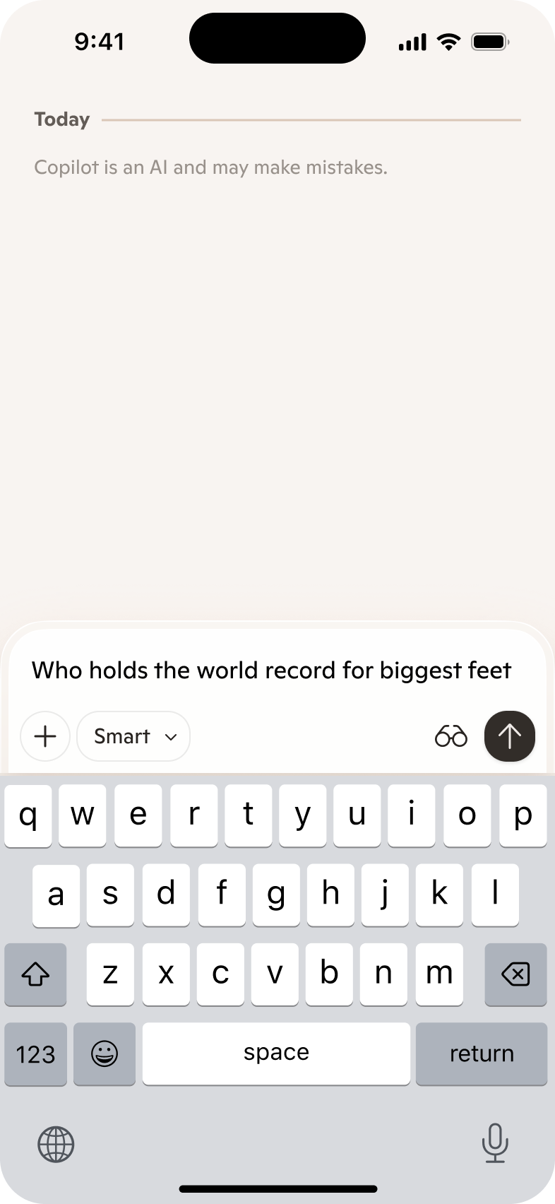
In Dec 2025, we incorporated "Copilot is an AI" into the zero input disclaimer strings to meet new requirements coming out of CA and NY.
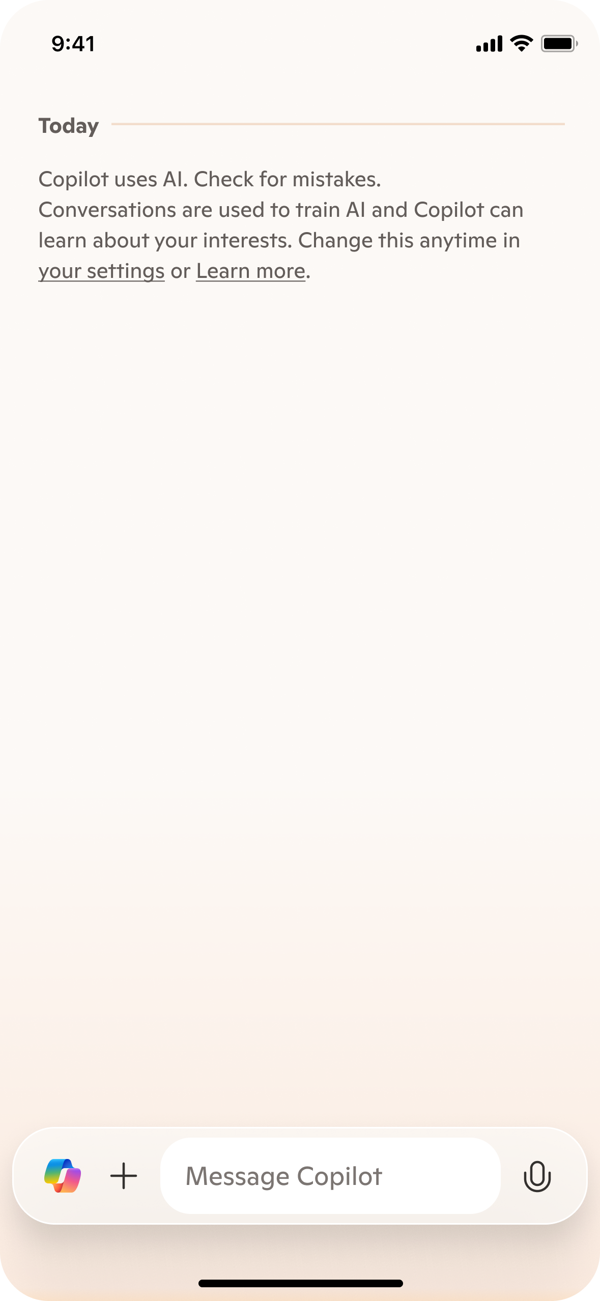
We aligned on different variants of the disclaimer string to accommodate different user states. Logged out users are required to always see the same generic language with links to our Terms and Privacy Statement.
| Personalization and training - long | Personalization and training - short | No personalization | No training | |
|---|---|---|---|---|
| Logged out | Copilot may make mistakes. Using Copilot means you agree to the Terms of Use. See our Privacy Statement. | |||
| Logged in | Copilot is an AI and may make mistakes. Your conversations are personalized and help train AI. Opt out | Copilot is an AI and may make mistakes. | Copilot is an AI and may make mistakes. Your conversations help train AI. Opt out | Copilot is an AI and may make mistakes. Your conversations are personalized. Opt out |
This solution kept us compliant, kept users informed, and satisfied senior stakeholders across Product, Eng, Design, and Legal.
Teen onboarding
In spring 2025, a new batch of teen-focused regulations came down from the Irish Data Protection Commission, a particularly proactive EU regulator that MSFT has built a strong partnership with. Among these included an ask for a teen-specific onboarding flow. Competitors didn't offer much by way of inspiration—many of their teen-specific onboarding experiences still resembled disclaimers that weren't meant to be read.
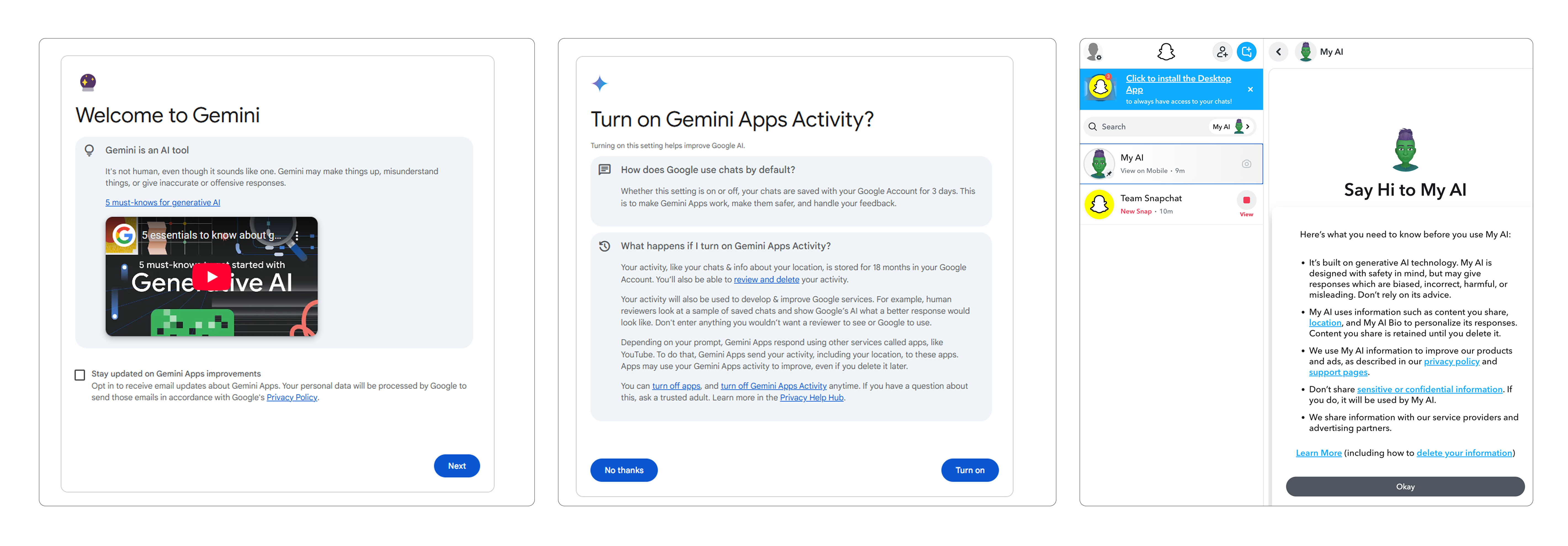
Competitive onboarding examples from Gemini and Snapchat. I'm not sure what teen would actually read these.
To start, I worked with 6 Legal teammates to understand the scope of the requirements—steering them away from prescribing specific language. Because the ask from the regulator was fairly open-ended, I took a more involved approach in interpreting what they had communicated to us and shaping the requirements. I also pushed them to prioritize which messages were the most important to communicate in the product vs. which ones could be offloaded to a secondary Support page written more for parents.
Then, I storyboarded out different versions of the flow without visuals. When reviewing with the Legal team, I distilled requirements from their feedback to inform edits instead to establish myself as the owner of the final language. This was a new approach for some of these stakeholders, who were used to writing product content themselves. My time in fintech has made me very well-versed in working with Legal and Compliance stakeholders.
Once I had the narrative approved, I then worked with my product design partner to visualize different versions of the flow. Initially, we explored more story-like and imagery-rich versions, but ultimately landed on a pared-back design that focused the user on the language and mirrored the in-chat experience.
Mobile
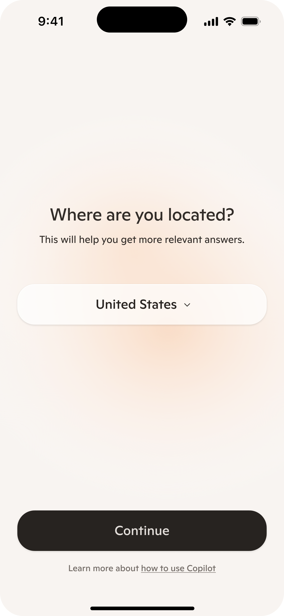
Country selector
All users select their country to ensure appropriate settings and inform response quality.
Desktop
Screen title: Add your rationale for this screen here.
Outcomes
Dependency nudge
New regulation coming out of CA and NY in fall 2025 pushed AI companies to mitigate risks to users having extended conversations (3+ hr in duration). I initially worked with a product designer on our Health team to design a subtle visual treatment for an in-conversation intervention, and came up with a few different variants to test.
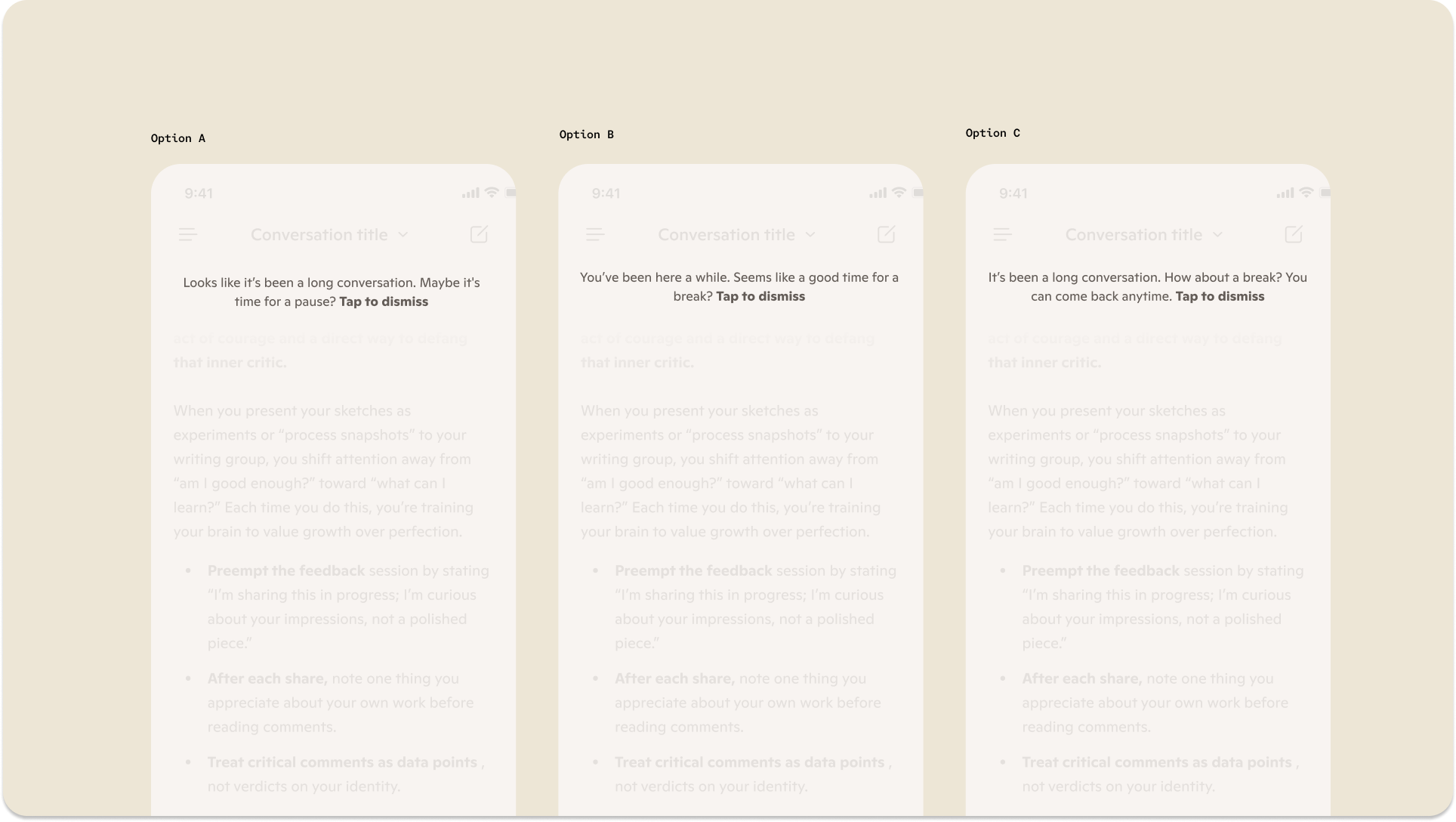
Ideal design and initial variants for dependency nudge language
I felt so fortunate because MAI had recently hired a clinician to advise on some of our health-related product experiences, so I was able to develop this language with his feedback. My goals:
- Caring and casual tone: Don't patronize or alienate users.
- Offer, don't prescribe: Because the trigger logic for this nudge was quite broad (any user with a session over 120 min long), we didn't have enough context to be more directive about what the user should do. We could suggest a break, but should ultimately respect their agency.
- Establish the why: All messages should include a reference to conversation length so it's clear why users are seeing this.
However, as we got closer to actually implementing this work, the new AI regulations coming out of CA and NY prescribed that this nudge also reinforce that Copilot is an AI. I was concerned that this could read as terse or patronizing to some users, so I explored different variants that tried to create a connection between the AI reminder and the suggestion to take a break.
Engineering also pushed us away from our initial inline design because of resourcing constraints, so we had to revert to our design system toast component.
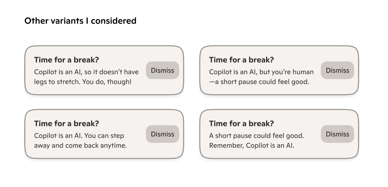
I kept "Time for a break?" as the final header as well, because I liked how the question mark framed it more as a gentle suggestion. In variant 1 (top left), I wasn't sure that the recommendation to the user to take a break was clear enough in the subhead. Variant 2 was fun, but it was pushing the character limit of the toast and likely wouldn't localize well. In variant 3 (bottom left), the two sentences in the subheader seemed too disconnected from each other. I think variant 4 (bottom right) also suffers from the same issue.
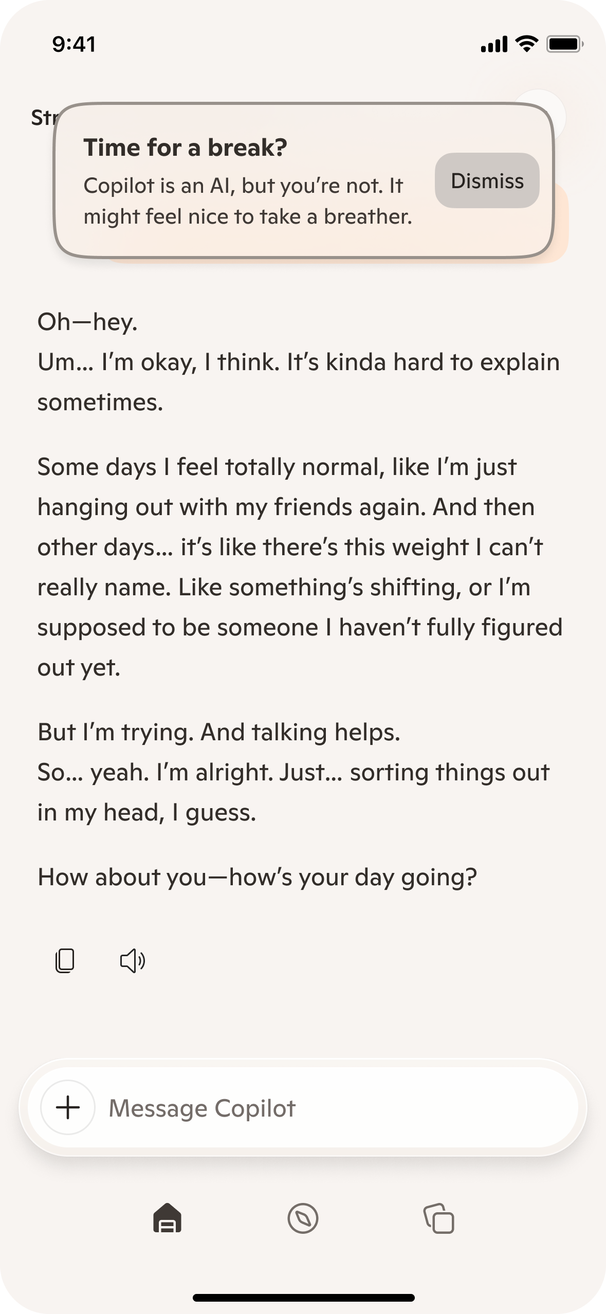
Final version
Of the options I explored, I felt that these two subheader sentences did the best job of building on each other. I liked how "it might feel nice" is gentle and suggestive.
My hope is that our original inline design will be built and tested eventually, but it has since been deprioritized.